Safe, effective natural personal care.
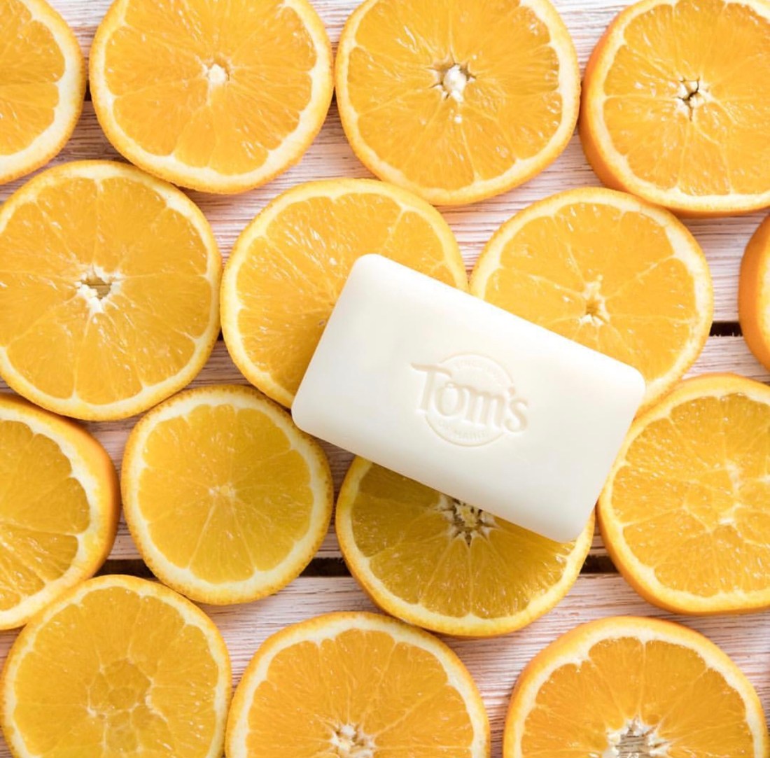
From oral care to antiperspirant and deodorant and baby care to body and lip care, all of Tom’s of Maine packaging are designed to greatly emphasize that each product is natural. The toothpaste boxes have a clean look with the consistent green color taken from Tom’s label, which is also the color of the toothbrushes. You can see this green color incorporated on the tops of baby shampoo bottles, lotions, diaper creams, and sunscreens. Images of nature are also a consistent theme on the front of the boxes or packaging. Complimenting color schemes are used with the images from nature and the different flavors or scents that are labeled on the packaging. When it comes to the bottles and packaging of the body and lip care products, the same design theme is seen from that of the baby products. The products’ initial design appeals to the eyes of those looking for a soothing, natural, soft, and calming experience. It is the short sentences or single words found on the front of the products that make customers feel good about their purchase. Below I have provided images of the Tom’s of Maine products:


Sources:
https://www.tomsofmaine.com/products
https://instagram.com/toms_of_maine?utm_source=ig_profile_share&igshid=14qozghbtdhxj